Status Light Guide
What is a Human-Machine Interface (HMI)?
A human-machine interface is a device component that leverages hardware and software, empowering end-users (humans) to operate and communicate with machines and equipment.
HMIs can be developed for one piece of machinery alone, or a collection of complex devices that must all work together under one control system architecture commonly referred to as supervisory control and data acquisition (SCADA).
Other terms can also be used interchangeably with HMI, including:
- Control panel
- MMI – man-machine interface
- OIT – operator interface terminal
- Operator panel
- UI – user interface
“While HMIs can be referred to in many terms, they should all have a singular focus: effectively communicating with the end-user for safe operation.”
Whether it’s the wireless keyboard on your desk or the control panel on an automated food processing line, HMIs enable us to control and communicate with just about every electronic device you can think of (and probably some you can’t).
It’s not all about convenience either, poor HMI indicator design has been linked to billions in lost productivity, abnormal readings, and even fatalities. Therefore, getting the HMI indicator design right is critical.
There are several decisions that should go into developing the interface, including visual language and design. The sooner HMI specifications are mapped out, the fewer trade-offs designers will have to make once the device footprint and other constraints have been established.
From monitoring safe pH levels at a water treatment plant to a beacon signal or status light on an airplane control panel, operators rely on intuitive, fast communication with their machines constantly. And status indicators on the HMIs are how they do it.
But first, what is a status indicator?
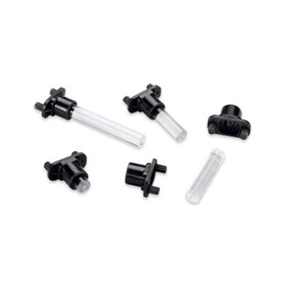
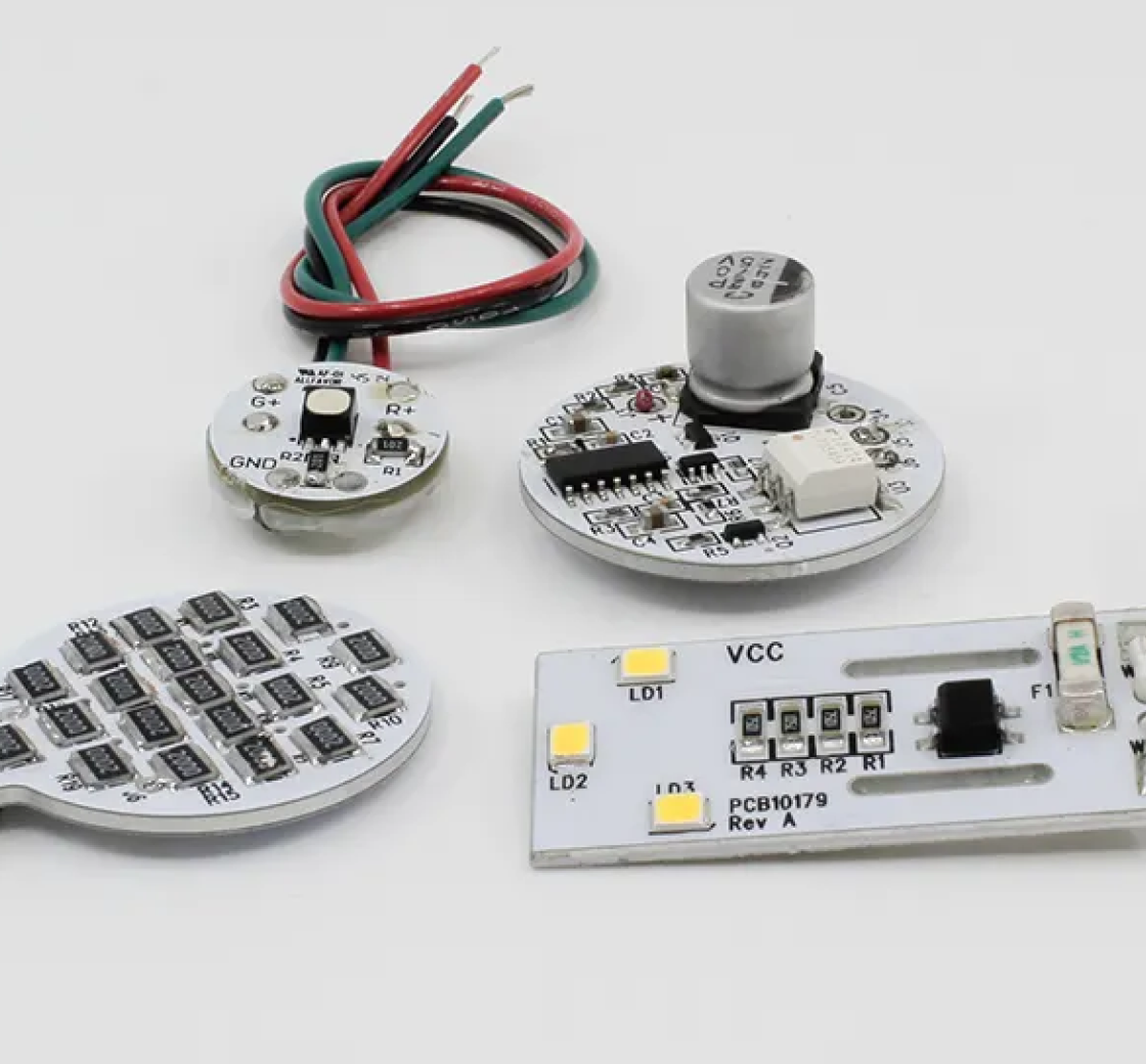
A light pipe is placed very close to an LED light source on one end of a PCB board. Its optical-grade materials help carry the rays of light to the desired destination, typically at the user interface of a device.
Light pipes transmit roughly 80 to 90 percent of the light from the LED source, depending on design and spacing. The closer the light pipes are to the LED(s), the more efficiently they can transfer light.
Of course, the light pipe(s) used will need to be rated for the same amount of heat that is produced by the LED or light source, so that must be a design consideration as well that can dictate the minimum allowable distance between the light pipe and the light source.
Does indicator design really matter?
It’s not all about a sleek design aesthetic with lights that complement a brand’s color palette. Using properly designed indicators facilitates safety and efficiency for end-users, and the heart of HMI design.
In fact, EU-OSHA, the European Union’s occupational safety organization, has deemed the human-machine interface as an emerging risk. Here are a couple of reasons why:
- Complexity of new technologies and processes associated with the HMI, which lead to increased mental and emotional strain of end-users
- Poor HMI design – when controls are too complex or require high forces to operate, errors are made, and workers can even hurt themselves
All of these issues are good evidence that indicator design does more than matter…. It’s everything!
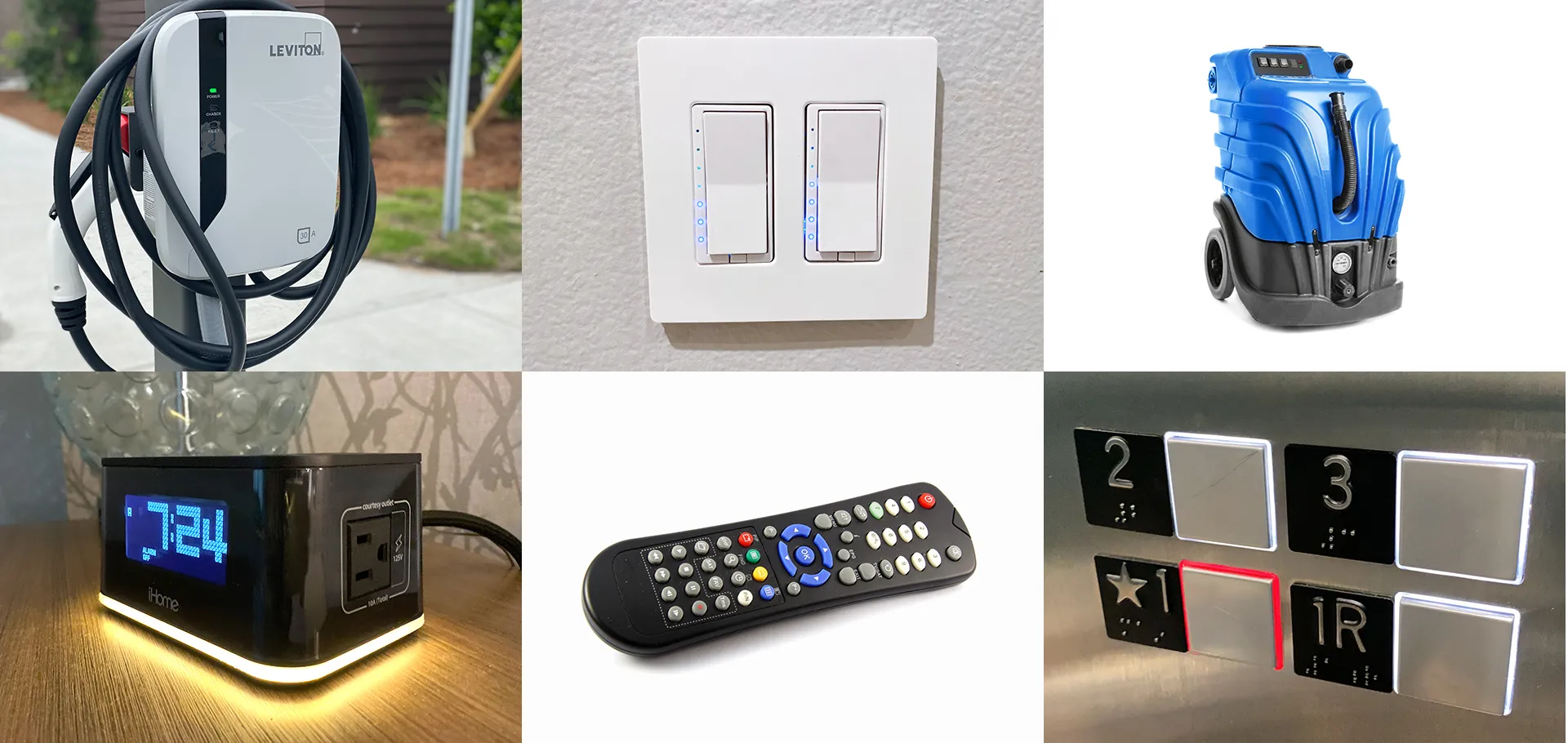
Which Industries Use Status Indicators?
A Brief History of HMI Indicator Technologies
1980s
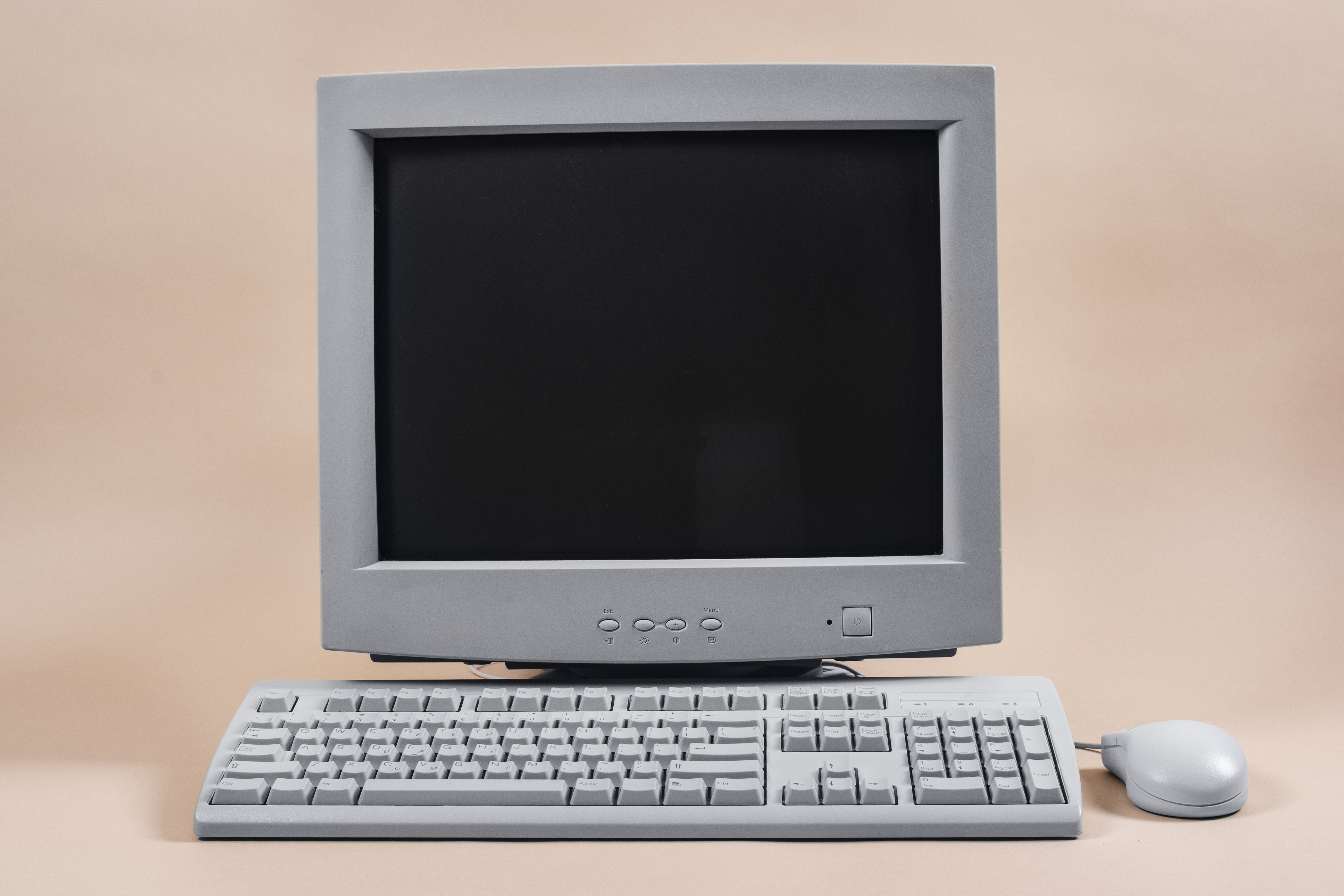
In the pioneering days of information systems, machines used push buttons, dials, and panel gauges to control individual pieces of equipment. Developing HMI controls required extensive programming knowledge to make computer software link with the display unit. HMI Design 1.0 was in full swing, yet programming these interfaces was complex, time-consuming, and expensive.
Then, proprietary MMIs (man-machine interfaces) became available for control rooms, and proprietary OITs (operator interface terminals) for on-machine control. Specialized HMI design software (HMI Design 2.0) made programming and configuring HMIs simpler to some degree, but it was still pretty involved to set up an HMI with the appropriate tags.
1990s
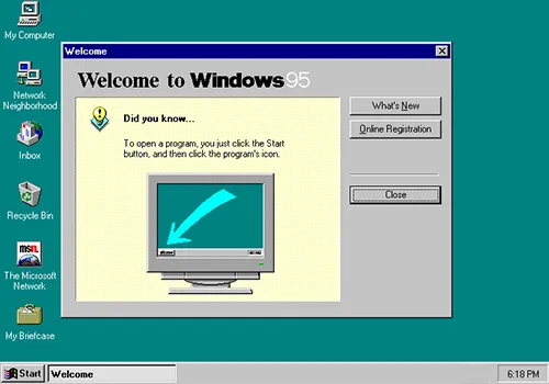
PCs come on the scene and change the game. Microsoft and others introduced operating systems and software independent of the platform. Then HMIs evolved from hardware to software focus, as HMI Design 3.0 took shape. Then, in the late 90s, ethernet technology was introduced, removing the boundaries of connectivity.
2000s

2010s

2020 and Beyond
Selecting the Right Status Indicator
Status indicators are created using either light pipes or PMIs. There are a few considerations that could dictate which status indicator type to use. For example, if an HMI is fairly simple with a few indicators, a PMI would make more sense. But if the interface has several indicators on it, using light pipes would be preferred for budgetary reasons.
Once you’ve determined PMIs are the way to go, choosing the right panel mount indicator for your application and device will require determining many factors, including:
Size
How much room do you have on the panel for your indicator? Some indicators are housed on thicker HMI panels and need to be more robust, while others are very limited in their footprint.
Color
Color choice can impact reaction times, how intuitive an indicator is, as well as branding.
Working environment
When temperature, humidity, moisture, and vibration are part of the job, special considerations like IP protection should come into play.
Lens
The shape and type of lens can change the amount of daytime or nighttime visibility, and determine the indicator’s viewing angle.
Power
How much power does your indicator need? Some may be surprised to discover that not all LEDs are low-voltage. VCC offers indicators ranging from 2V all the way to 220VAC – ideal for industrial operations. For example, VCC retrofit an industrial dishwasher with a status indicator from neon to LED technology. Because 125VAC and 250VAC LEDs were available, the upgrade was a snap.
Constraints
The device’s design and layout of the HMI must be factored in when choosing the right indicator for the application.
What Does Effective Indicator Design Look Like?
The Case for Visuals vs. Text

Humans process visual data better than any other type of information. So why not make the machines and devices that power our world more intuitive to operate through effective indicators?
Research from MIT proves it only takes 13 milliseconds for a brain to process an image. Think about how much faster your reaction time could be if a machine needed to be turned off while overheating!
Importance of Good User Interface Design
The importance of a user-friendly interface cannot be understated. Conventional wisdom, “form follows function,” still applies in the modern age. It may be tempting to start with the aesthetics, but engineers should remember to keep their end-user in mind and how the device will actually be used when designing the interface.
Think good design is a “nice-to-have?” Think again! Problems in development can be 10x more expensive to correct than when found during the design process. And 100x more expensive to fix after a product has been released!
Savvy companies understand how to integrate form and function in ways that we don’t even realize. Apple is a prime example.
Panel Mount Light Pipes
From the moment you open up the box with the latest iPhone, you can see how the details have been obsessed over.
- Everything has its place, there’s no excess packaging or plastic.
- There’s no slipping or sliding around in an oversized box.
- Once you turn on the device to set it up, the process remains intuitive.
These seemingly added bonuses are essential to ease of use and brand loyalty.
On the flip side, have you ever used a device that was so difficult and impractical you wanted to throw it across the room? That’s the opposite of what you should be going for. Designed properly, a user interface is easy to navigate with little to no instruction.
The goal of any device design should be to make the end-users’ interactions as simple and efficient as possible. Smart products have gotten this right while still allowing for an aesthetically pleasing design. Well-designed products, meaning those that offer a friendly user experience:
- Work better/are more successful
- Make end-users feel good about using them
- Drive brand loyalty
It all comes down to the overall design of the product. Have the user interface (UI) and user experience (UX) been carefully considered?
What’s the difference between UX and UI?
Effective product design requires careful consideration when developing a user interface (UI), as well as the user experience (UX).
While the two are used interchangeably, they are quite different…
UI Designing the look, feel and functionality of your product
UX Creating a positive experience with your product
Both are important to the overall success of your design. And when the two work together — where prioritizing a simple experience, then complementing it with a look and feel that add to the delight — you and your end-users win.
User interface (UI) vs. User experience (UX)

The UI example shows how the ketchup bottle will look while it isn’t in use. For an end-user who needs to use the product, the process looks like this:
- Pick up the bottle
- Unscrew the cap
- Set the cap down
- Flip the bottle upside down with one hand
- Smack the hard glass bottle furiously with the other hand
- Flip bottle back over
- Set the bottle back down
- Screw lid back on
- Eat fries (that may be cold by now)
The UX example was designed with the end-user in mind — how the product really gets used. By redesigning the bottle around how the product is actually used, three steps have been completely eliminated:
- Pick up the bottle
- Flip open plastic cap
- Squeeze with one same hand
- Flip cap shut
- Set bottle down
- Enjoy piping hot fries!
User experience design requires a deep understanding of who will be interacting with your product. What are their needs? Desires? Values? Limitations? Expectations?
It will likely take collaboration from multiple team members to define who the end-user is and what they need.
7 Attributes = 1 Awesome UX
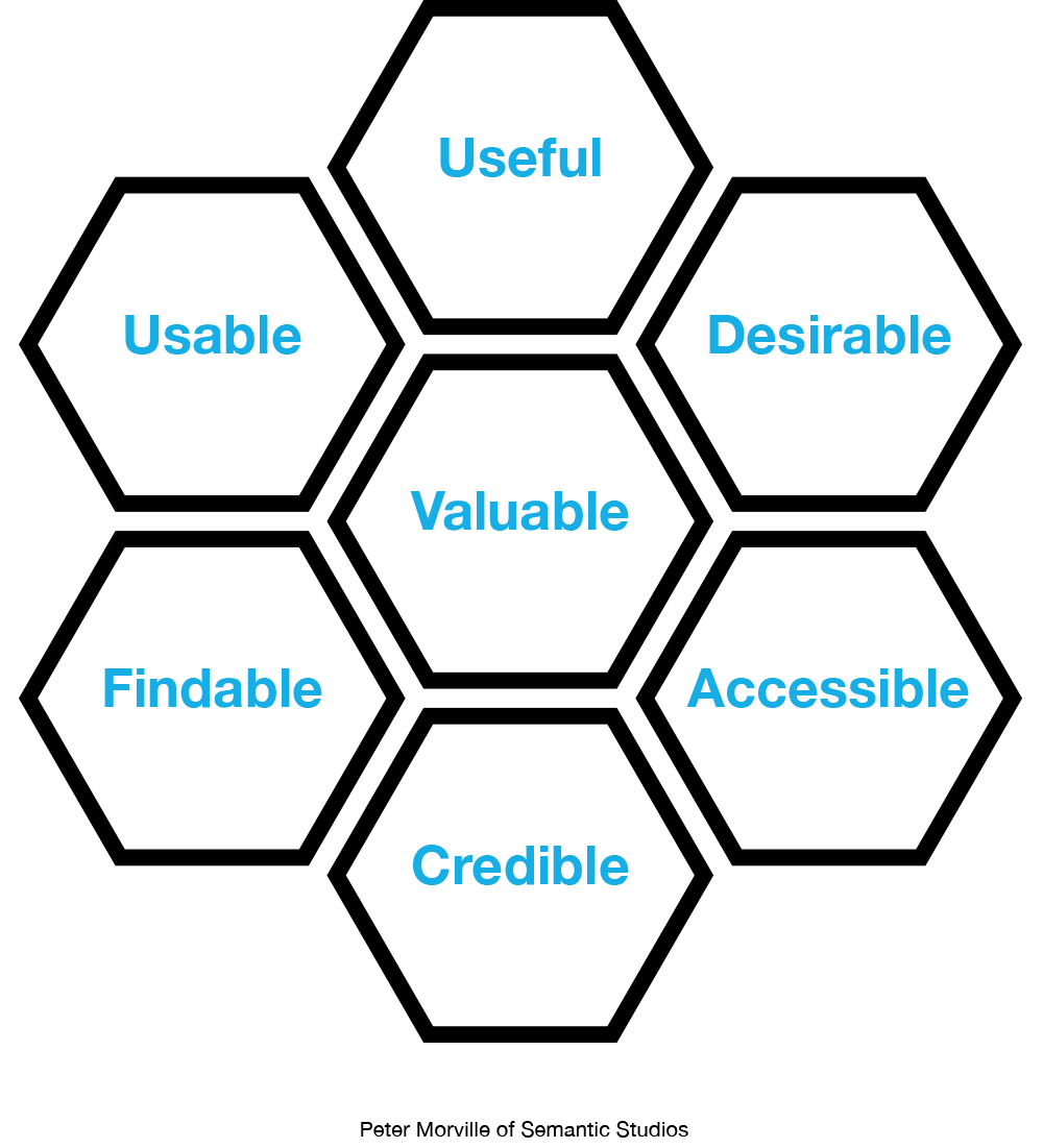
To ensure the best possible user experience, use these seven attributes as your ultimate checklist:
- Useful: Does the information fulfill an actual need? If not, what’s the point?
- Usable: Is your experience intuitive to users? There’s nothing more frustrating than an overly complex interface.
- Desirable: How does the interface make users feel? Design, color and the complete package should evoke positive emotions.
- Findable: Do users have to work too hard to navigate their way around the interface or panel? If so, keep pushing the design until the ultimate user experience has been determined.
- Accessible: Can a diverse group of users operate your device? Your interface should work well for people with disabilities.
- Credible: Do users feel like they can believe what you and your product are telling them?
UCD, For the Win (FTW)
User-centered design (UCD) should be implemented from idea to production. As the name suggests, the user-centered design approach is one where every decision revolves around what’s best for the people who will be operating your product.
UCD is an iterative process that requires input and evaluation from multiple stakeholders. All of this effort on the front end ultimately leads to better results, including:
- End products more in line with users’ needs and expectations
- Safer products due to multiple task-specific tests that mimic human errors
- Collaboration between users and designers creates empathy and leads to better products that don’t compromise privacy
- Varied user tests drive greater accessibility for a wider audience of diverse cultures
1.Specify the context of use
Teams should collaborate and conduct research to determine the 5 Ws (who, what, when, where and, why) surrounding use of the product.
2.Determine requirements
What will make this product a success? What are the non-negotiables around business or end-user goals?
3.Develop potential design solutions
Teams should collaborate and conduct research to determine the 5 Ws (who, what, when, where and, why) surrounding use of the product.
4.Test and evaluate solutions
Conduct user testing to see the product in its actual environment and scrutinize every aspect of the design.
Fast Tips for a Friendly User Experience
Feeling a little overwhelmed about the importance of a user-centered interface? Here are some high-level tips to get your UX and UI ideas flowing:
- Put yourself in the user’s shoes
- Do one better and conduct usability testing
- Focus on the user’s needs
- Never assume how a product will be used
- Simplify, simplify, simplify
Understanding Status Indicator Design:
Human-Machine Indicators
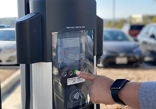
At home, we use status indicators to operate the devices we use to make our lives easier every day. Yet, in certain industries and applications, effective visual indication is also a safety issue. The faster an operator is alerted to a warning or issue, the better their reaction time will be to resolving it.
But not all status indicators communicate in the same way (or even the same colors).
Depending on the space available and range of status states that need to be communicated, it may make more sense to have a single indicator for each separate status notification.
For example, this MIG welder uses separate single-color LED status indicator lights to communicate critical status updates:
Blue – auto-set, or good to go, Yellow – overheating warning

One Indicator, Multiple Colors
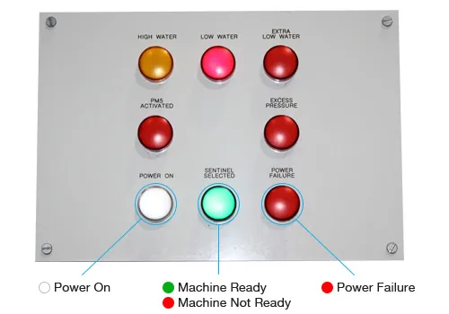
When space is limited, a bi-color or tri-color indicator can communicate multiple functions while using only one indicator footprint on the control panel or interface.
To streamline the HMI panel, VCC created a bi-color solution for this power grid monitoring panel. Red and green lights in the same indicator are used to communicate status.
One Indicator, Multiple Modes
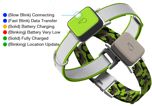
A single color can also be used to effectively communicate multiple functions via the cadence of the illumination. The light can flash or remain solid to indicate pairing with Bluetooth, charging, normal operation, or whatever the designer has in mind.
For smart devices used in IoT applications, tiny LEDs are hidden behind a front panel and only show when the status needs to be communicated. The smaller the device, the more thoughtful the HMI should be. Many devices use a combination of indicator communication styles to indicate multiple functions.
Here’s how one smart product, the Whistle pet tracker, uses color and cadence to communicate a variety of functions:
- Pulsing blue (slow) – during set up, while the device is connecting to Bluetooth
- Blinking blue (fast) – while the app is open near the Whistle tracker or during a family trip, transferring data via Bluetooth
- Blinking red or amber/orange – tracker’s battery is very low and needs to be charged
- Solid amber/orange – tracker is charging
- Solid green – tracker is fully charged
- Blinking green – tracker is updating location (during Track or Locate)
How To Determine Your Ideal HMI Indicator Design
So, how do you determine which visual language to use in your status indicator?
Keeping the end-user in mind, consider:
- Size and space limitations of the device – how much room do you have to work with? Smaller footprints may dictate the multiple indicators vs. one decision for you.
- How and where the device will be used – is the device portable? Will it be used outside where daytime visibility is a concern? How about the viewing angle? Will the end-user need to see the controls from standing, bending or elevated angles?
- Review the visual languages of other devices used in your industry – do other common devices used in tandem with yours have a similar communication style? Do they blink while in use, or stay solid? Look for patterns that could make your product that much more intuitive for the end-user.
- User experience – what will make the most intuitive experience? One indicator with multiple colors? Separate indicators for each function? A combo of the two?
- Building on what your end-users already know – thanks to traffic signals, we’ve been programmed to know what red, yellow and green lights symbolize: go, yield, and stop. Why not use red to signal an alarm or green to give the all-clear instead of requiring users to learn a new visual language? Here are some common colors and what they mean

- Your brand’s look and feel – indicators can enhance your brand’s identity, but aesthetics should always take a secondary role to the user-centric design of your product.
- Placement of the indicator – similar to size and space limitations, are there ways to make it even easier to see and use your device? For example, Amazon’s Alexa includes a circular light around the edge of the product in addition to a standard indicator.
Of course, the budget will also come into play when considering options as you design industrial human-machine interfaces. Fortunately, there are solutions available through human-machine interface manufacturers to help engineers and designers balance optimal UX with production costs that won’t break the bank.
Visual Indicators Provide Invaluable Efficiency
As we previously mentioned, using colors instead of text to communicate the status of a device leads to faster reaction times and better user experience.
Yet, visual indicators can also help differentiate between objects that otherwise look similar. We see them everywhere in daily life, from a typo that’s underlined in your Google Doc to a green light telling you there’s one more parking space left in the public garage.
But, what happens when the visual vocabulary of your device incorporates color and imagery to communicate status? According to one study by Nielsen Norman Group, the ideal UX includes a combination of icons and color to communicate.
The study found users are 37% faster at finding the correct items on a web page list when color and visual indicators are used.
Research was also conducted to compare results for:
- Text only
- Color only
- Icon only
- Color + icon
By monitoring user behavior on various web pages that featured the four indicator types, the study logged four key metrics:
- Time to first click
- Time to first correct click
- Time to complete task
- Rate of success (how many clicks were correct out of the 3 possible)

Guidelines for Display Interface Design
User interfaces are the key component for the successful operation of a device, whether it’s a software application or tangible machine. Hardware interfaces can be found in a slew of household products, from toasters and microwaves to thermostats.
And hardware interface design (HID) can make or break a product. HID is a cross-disciplinary field that connects the physical connection between people and technology to optimize interactions.
Designing hardware interfaces should follow the same user-centric design principles used in software design. For best results, remember to:
- Empathize with the end-users
- Present all necessary information for a single decision process visible at the same time
- Involve the end-user in design decisions (conduct usability testing)
- Design for error tolerance — humans will make mistakes
- Avoid TMI (too much information)
- Prioritize practicality over product looks
User Interface Design for Hardware
Effective UI design is all about anticipating the needs of the end-user. Then making sure the interface design facilitates those actions through intuitive, easy to access steps. UI brings together concepts from:
- Visual design
- Information architecture
- Interaction design
Highly functional does not equal intuitive. For example, take a look at your microwave. Does it really need all of those buttons?
As you can see below, it took a while for the interface to evolve to meet the needs of the user. And in most cases, it still hasn’t, meaning some microwave designers should see above for user-centered design best practices.

What other products around your home or office could use a revamp in the interface design? This exercise can help you be more empathetic to the end-users of whatever product or device you are designing.
Can your device be correctly operated with little to no training or onboarding? That’s the ultimate goal in HMI design, whether it’s a microwave or a medical device. Contrary to instinct, sometimes the latest and greatest tech isn’t the best solution for your interface. By empathizing with the multiple groups and sub-groups who may use your product, you can ensure your interface is intuitive.
Other human-machine interface design tips include:
- Design for error tolerance since humans make up the “H” in HMI. The interface design should provide real-time feedback to call out an error, as well as provide time and actions to help reverse or rectify the situation.
- Ensure tasks require some level of active involvement from the operator while minimizing repetitive or passive actions.
- Make safety-critical steps incremental instead of having them all take place on the same screen or at once.
- Clearly differentiate between the error messages involved with overriding safety-critical and non-safety-critical actions.
We cannot stress the importance of good user interface design enough. If you’re ready to explore how various status indicators work and design considerations for each, check out the following resources from VCC:

