Get more from what meets the eye
Interfaces in industrial equipment have come a long way from the simple on/off switch. But there is still much more to be explored in order to provide a safer, more productive user experience.
Why should more thought go into the design of human-machine interfaces? The benefits speak for themselves:
- Improved worker safety
- Enhanced usability
- Decreased training time
- Increased machine uptime
- Greater productivity
- Less room for operator error
From industrial applications to food processing, transportation and medical, industry verticals are each moving at their own speed to address new features and user needs when it comes to the design of device user interfaces. The good news is, you don’t need the latest and greatest touchscreen or wearable HMIs to reap these rewards.
There are many things to consider that can enhance the human-machine interactions and improve usability:
Color scheme

Equipment operators are already conditioned to understand the visual vocabulary of traffic light colors: red, green and yellow. Do you plan on communicating with operators in that manner, or will you add even more color cues?
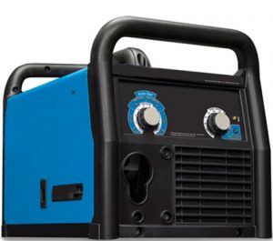
For example, this MIG welder, used in manufacturing, metal fabrication and home applications uses colored LEDs to communicate important information to operators in the blink of an eye:
Blue = the auto-set function is enabled, allowing faster and safer setup
Yellow = the machine is getting too hot / close to overheating
VCC’s Standardized Color Chart

Light functionality
In addition to the actual colors, how the lights function can also enhance operation.
- Will a specific function include one light that changes in color, like going from red to green to indicate the machine is warmed up and ready to go?
- Will the light blink to indicate normal operation or flag an issue?
End-user experience
The quiet office where HMIs are designed is a far departure from the environments in which it will be used. To ensure the interface is developed with the best possible visual communications, the designer should always interview the end user and apply all learnings to the HMI design. At the very least, the following should be taken into consideration:
- Working environment – Will the machinery be used inside a clean (or greasy) warehouse, or out in the field where it is exposed to the elements? It’s important to ensure enough contrast in the light that it can be seen during the brightest daylight hours without operators having to stop what they are doing and walk over to the machine or get close to it. For daytime and outdoor operation, using the appropriate illumination technology, such as LEDs with high mcd and maximum driving current along with a diffused lens to disperse the light on all sides, will increase output and enhance visibility.
- Operator roles and responsibilities – What is the typical job description and day-to-day work like for the operators?
- Other machinery commonly used in this role – Is there already a visual vocabulary (including a non-official one) that should be considered?
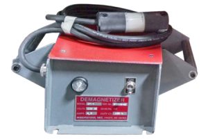
- Viewing positions used during operation – Will operators be standing on a ladder or scaffolding? Will they be lying on the ground? Viewing angle is a key consideration to ensure operators can see what is happening with their machine without having to constantly climb up down, bend or otherwise create unnecessary safety risks.One example of optimized viewing angles is this demagnetizer control panel used in heavy-duty machinery. In addition to being operated in harsh environments for extended periods of time, demagnetizers need to provide constant communication of operational status. By using a dome-shaped lens with an 180-degree viewing angle, this demagnetizer control panel informs end users of the machine’s status for enhanced operation and decision-making.

Industry safety standards
Illuminated components
Finally, determine the component(s) that will help you provide the best interface based on all of the criteria above.
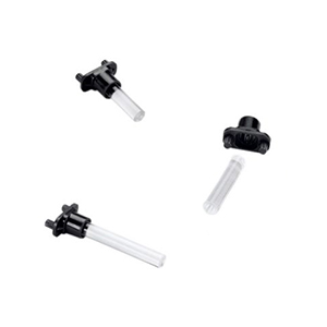
- Light pipes – transmit light from the surface mount or through LEDs to the display of the device. There are many types available to suit various applications, including rigid, flexible, moisture-sealed and right-angle light pipes.
- Panel mount indicators – available in a wide range of lamp types, sizes and styles, panel mount indicators are where the light(s) visually communicate with the operator on the machine.
- Capacitive touch sensor displays – combine graphic interactive control with color identification to enhance ease of operation. Can also be used to simplify design and streamline costs by eliminating the need for a traditional switch.
A well-designed human-machine interface can enhance usability, safety and productivity. It all starts with understanding the needs of the end user.
To learn more about increasing safety and productivity through the design of your industrial HMI, contact the VCC team today.


